Customer :
NovaCura
NovaCura are experts in business systems and process improvement. Their areas of operation primarily include production, distribution, service/maintenance, and finance.
Here, we look at how we created new icons for NovaCura.
When creating a set of icons for the same purpose, there’s a lot to consider. It could be different programs within a software suite, different functions within the same interface, or various parts of a company that need to visually align. Here, we look at how we created new icons for NovaCura.

NovaCura are experts in business systems and process improvement. Their areas of operation primarily include production, distribution, service/maintenance, and finance.

They needed help creating modern and appealing icons for their various applications, aimed at visualizing and matching their technically advanced solutions. In addition to application icons, a consistent set of icons was also needed for use in their process tool, Flow.
NovaCura also requested that the application icons be usable in other contexts, such as printed materials, banners, and videos. Therefore, all graphics were created as vector graphics in Adobe Illustrator, ensuring that the final delivery (apart from the icon files) consisted of original artwork that could be scaled up without any loss of quality.

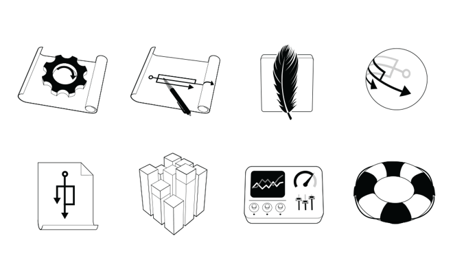
Texo is an integration platform, and visualizing it was much more abstract. We sketched out different ideas with arrows and flows being merged, but it was hard to interpret the icons, and they became too academic. We instead decided to return to the drawing concept from Flow, but with a gear symbolizing the automatic process. This clearly shows that the applications belong to the same suite, but serve completely different purposes.

In addition to these, we also created an icon for mobile devices, which needed to be fairly abstract since it was meant to cover a range of possible use cases. For the symbol of simplicity and lightness, we chose a feather. The lighting and perspective were chosen in line with the guidelines for Android interfaces, as the program will mainly be used on such devices. We also designed a general web icon with the same process arrows around a globe, as well as a document symbol.
The icons were also complemented with simplified outline versions, which are used on photographs and other graphics where a more subtle look is desired.

New, unified icons were also needed for use in Flow. Since the interface can scale seamlessly (to provide a good overview), it was essential that the icons be simple and clear. We focused on giving each icon a distinct color and silhouette, so that they can be easily distinguished from one another, even in very zoomed-out views where they shrink to just a few pixels.

In the fall of 2014, we created a series of illustrations for use in presentations and marketing materials. These illustrations symbolize NovaCura's various focus segments, as well as the people working within them. The illustrations were adapted to a slightly redesigned visual style, with a flatter and more modern feel. We are also in the process of updating the other icons and illustrations to align with this new direction.

Both we and the client are very pleased with the final work, and we look forward to seeing the icons implemented in the live software in the future.